Table of Contents

This isn’t a table of contents in the traditional sense. Rather, it’s a list of topics I wish to explore on this website. It’s meant to hold me accountable and remind myself why I’m doing this in the first place.

It’s a living list and will evolve over time.

  1. The science behind the creative potential of doing nothing/being bored.
  2. Explore the concept of the Flaneur and ‘Walk-Abouts’.
  3. Trying new and weird things. Getting outside of your comfort zone.
  4. Day dreaming and why being called a day dreamer is a compliment.
  5. The No Plan Zone. Feeling over-scheduled gives me hives.
  6. Perception of John Berger’s Ways of Seeing.
  7. Getting lost in Rothko.

Image Source: Tumblr

The Art of Doing Nothing

Drive_2

Drive

You’re here and you might be wondering why you’re here. And you may also be wondering why I would focus on a topic such as doing nothing or embracing boredom during a time when everything is about ‘experiences‘.  *barf*

All I can say is try it. Regardless of what you do for a living, the act of mindlessness can unlock new ways of thinking. Rewire your pathways. Give you new insight. Or simply make you feel good. It’s my secret weapon to solving complex problems and coming up with ideas.

This website is an exploration of this very idea and is an archive of things that are inspiring or intriguing.

If all you do is get lost in the above GIFs, I will feel like I’ve accomplished something.

Let’s get bored together.


The Art & Science of Being Bored

CelebratedSizzlingBoaconstrictor

The idea of doing nothing and the premise of this website, like all good things, is supported by research. But first, join me while I go down memory lane to the true inspiration for my website, my childhood.

I grew up during the 90s, a magical time without social media, limited internet, no cable (I now thank my parents for this), and a backyard that consisted of 40 acres of fields and woods. Weekends would roll around and I would inevitably moan to my parents: “I’m booooooored.” Rolling around on the ground like a piece of wet spaghetti.

Every kid says this or at least they did when I was growing up. But unlike other kids, I didn’t have MTV to turn to. My parents would always say: “Go outside and use your imagination.” *eye role* What a cop out. They are just trying to get rid of me.

Wow, was I ever wrong.

The ‘bored’ times I spent wandering in the woods is what made me who I am today.  Hours spent exploring every inch of those 40 acres without a plan, without friends, set my imagination on fire.

A fallen over tree with termite holes became a ladder and a lookout for what would become a made up classroom. Luckily for me a school shut down at the end of our street and I scored an old desk. It’s still there to this day.

An empty fox or coyote hole filled with me fear (where are they?) but also led me to imagine those woods as a Beatrix Potter-esque world.

I could go on. Point is, the ideas and fantasies I made up were endless and emerged because my mind was clear and I was incredibly bored.  This is what the Italians call La Dolce Far Niente or the sweetness of doing nothing. Not a new concept, just rarely practiced or celebrated.

I’m on a mission to change that.

Image Source: Sadly, cannot remember.
Lightmapping…

A special light painting tool displays radiation levels in real-time at the gates of a ruined church in Starye Bobovichi, Russia.  Here white light shows contamination levels up to 0.23uSv/h, while orange highlights elevated levels – from 0.50uSv/h to 0.85uSv/h around the gates.  30 years after the 1986 Chernobyl nuclear disaster, the schoolyard still contains areas of elevated radiation levels.
A special light painting tool displays radiation levels in real-time at the gates of a ruined church in Starye Bobovichi, Russia.
Here white light shows contamination levels up to 0.23uSv/h, while orange highlights elevated levels – from 0.50uSv/h to 0.85uSv/h around the gates.
30 years after the 1986 Chernobyl nuclear disaster, the schoolyard still contains areas of elevated radiation levels.

This is incredibly useful and absolutely stunning…

Photographer Greg McNevin overlaid measurement graphs on images to visualize the amount of radioactivity in Chernobyl.

This is a perfect example of the power of data visualization. It makes complex things visible. This has so many uses for other parts of the world and situations (gas leaks).

Can’t wait to see what he does next.


why visualization…lecture by isabel meirelles

isabel_meirelles

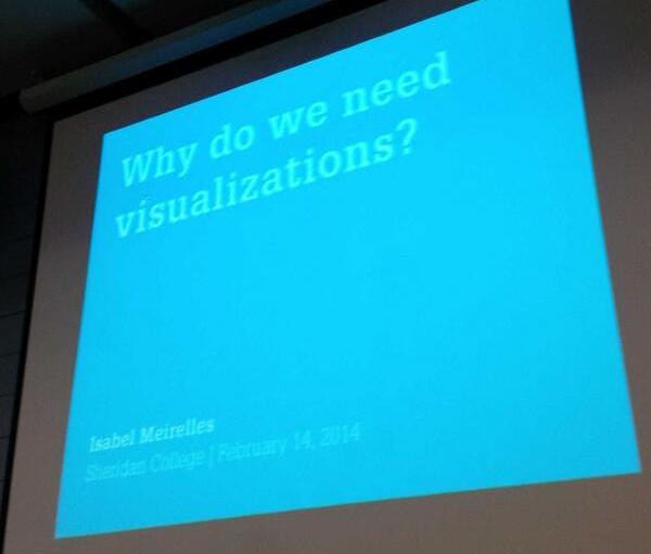
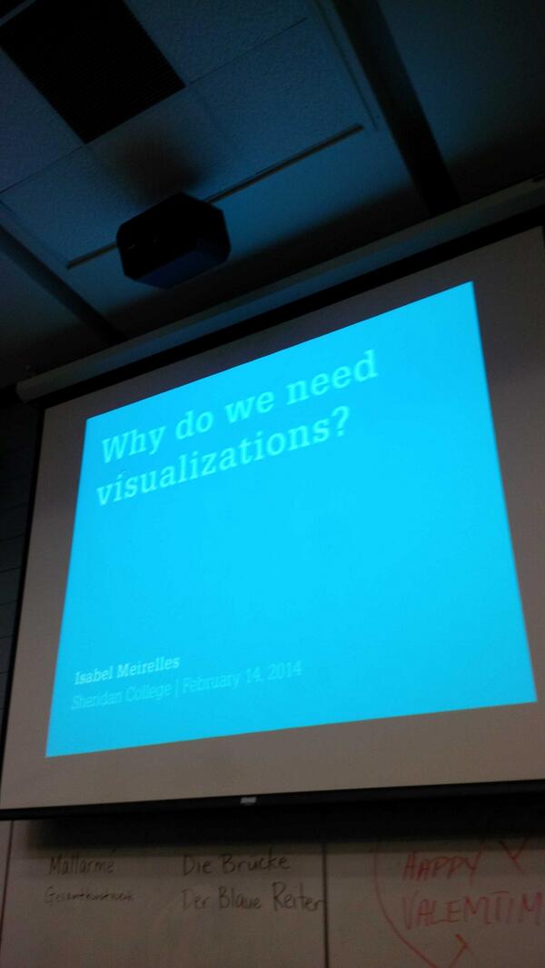
A few weeks ago I hopped on the Go Train and headed to Sheridan College to attend a lecture by Isabel Meirelles. The title and focus of the lecture was on why we need visualizations, a subject I regularly touch on in my workshops.

The lecture was packed with at least 100 students and faculty who came from a variety of backgrounds (design, technology, business). This underlines that information visualization touches a variety of fields and that’s really exciting.

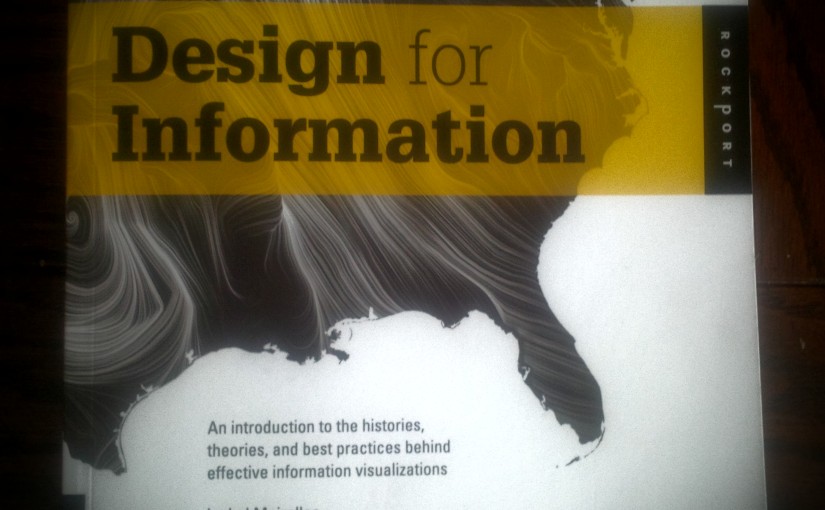
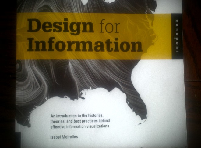
I recently picked up Isabel’s recent (amazing) book which she touched on throughout the lecture. My two favorite infoviz books are now Alberto Cairo’s ‘The Functional Art’ and this one. I’m going to be using both as my guide for my upcoming course at George Brown (more details to come).

The So What?

Isabel showed a few visualizations that were stunning but didn’t really have an insight or didn’t answer the ‘So What’ question. As an analyst this very question is what drives my work and when I consult on visualization projects the same applies. Yet projects continue to be developed that yield little insight but look amazing or are technically very complex. I have an art background and everything I studied and researched had a purpose and insight. Even the Minimalists with their blank canvases and plastic cubes had a purpose in mind even if you had to read through several essays to understand said purpose. A series of metal boxes may leave you wondering but with a bit of research it’s clear what Donald Judd was after.

I’m not sure these modern data visualization artists can say the same. There’s a sea of data at our finger tips but without a clear objective it becomes visual clutter. The signal to noise ratio is slightly off-balance and hopefully will even out. One can hope.

As Mr. Cairo says, visualization is a tool and I will stand by that until the cows come home.

my first slope graph…

I wanted to learn how to make a slope graph so with the help from this post and this data I ended up with the below. My brother has been on me about creating some secviz (security data visualization) and after checking out David McCandless’ Information is Beautiful take on this data….I couldn’t resist. Plus, open data FTW.

There’s so much more to the story in relation to this data. A lot of context is missing but I was just too excited and needed to share my first ever slope graph. More to come!

Created this little guy in Excel believe it or not. Super easy. Now don’t be a n00b and up your security game.

Screen Shot 2013-11-23 at 3.53.51 PM

Data Source: http://www.privacyrights.org/data-breach

sharing my love affair with data…

This past week I gave a talk to a group of Humber PR post-grad students about social media and digital analytics, with a focus on storytelling with data. Although the class was interested in best practices they were super engaged when I discussed what they could expect at their first job. Specifically, which tools or scenarios they would be faced with.

Before the talk I chatted with a few friends who took the program and asked what they would want to hear. Sure enough it was a) what to expect and b) what cool clients or projects could they work on. Taking their advice truly made a difference in keeping the class engaged.

I then opened a discussion around things they were working on and helped them determine the best way to measure their success.  I kept it simple, straightforward, and encouraged them to not be scared of numbers.

I even threw in a Data GIF for good measure.

It was an incredible experience and reminded me why I always wanted to teach.

On to the next one.

Brittany Dow Speaking at Humber

out of sight, out of mind….

My colleague shared a very powerful data viz project with me today by Pitch Interactive called ‘Out of Sight, Out of Mind’. This animated and interactive visualization brings to light the the number of casualties from drone air strikes in Pakistan since 2004.

Each click is like turning a new page in a very sad but true story. What has been ‘out of sight’ to-date is now clearly displayed for all to see.

A truly shocking image and a sad reality of war.

Projects like this are examples of how data visualization can be leverage to shed light on information disguised by the media or government, and (ideally) drive change.

Here’s to hoping.

DFG (data for good).

Slide1